Cooper & Bella
An early-stage pet wellness startup with big ambitions and a small budget. The brief was “clinical, but fun.” I set the creative direction so the brand reads less like a lab and more like a friend who happens to know the science, then carried that decision through packaging, a fully art-directed AI photography library, and a conversion-built Amazon listing.
The Brief Was Clinical. The Opportunity Was Warmth.
Cooper & Bella came to me as an early-stage startup with real formulation credibility and a category problem: functional pet supplements almost always default to cold, sterile, pharmacy-aisle cues. The client wanted clinical. My read as creative director was that clinical alone would make them invisible, and forgettable.
So I held the credibility and changed the temperature. I refined the identity and packaging to feel warm and playful, built a premium AI photography library so a startup could launch a polished catalog before it could afford a full production shoot, and developed a complete Amazon PDP for the hero product (image stacks, infographics, comparison charts, and A+ Content) all engineered to earn trust fast and convert.
Brand Direction
A friendly script that earns trust without wearing a lab coat.
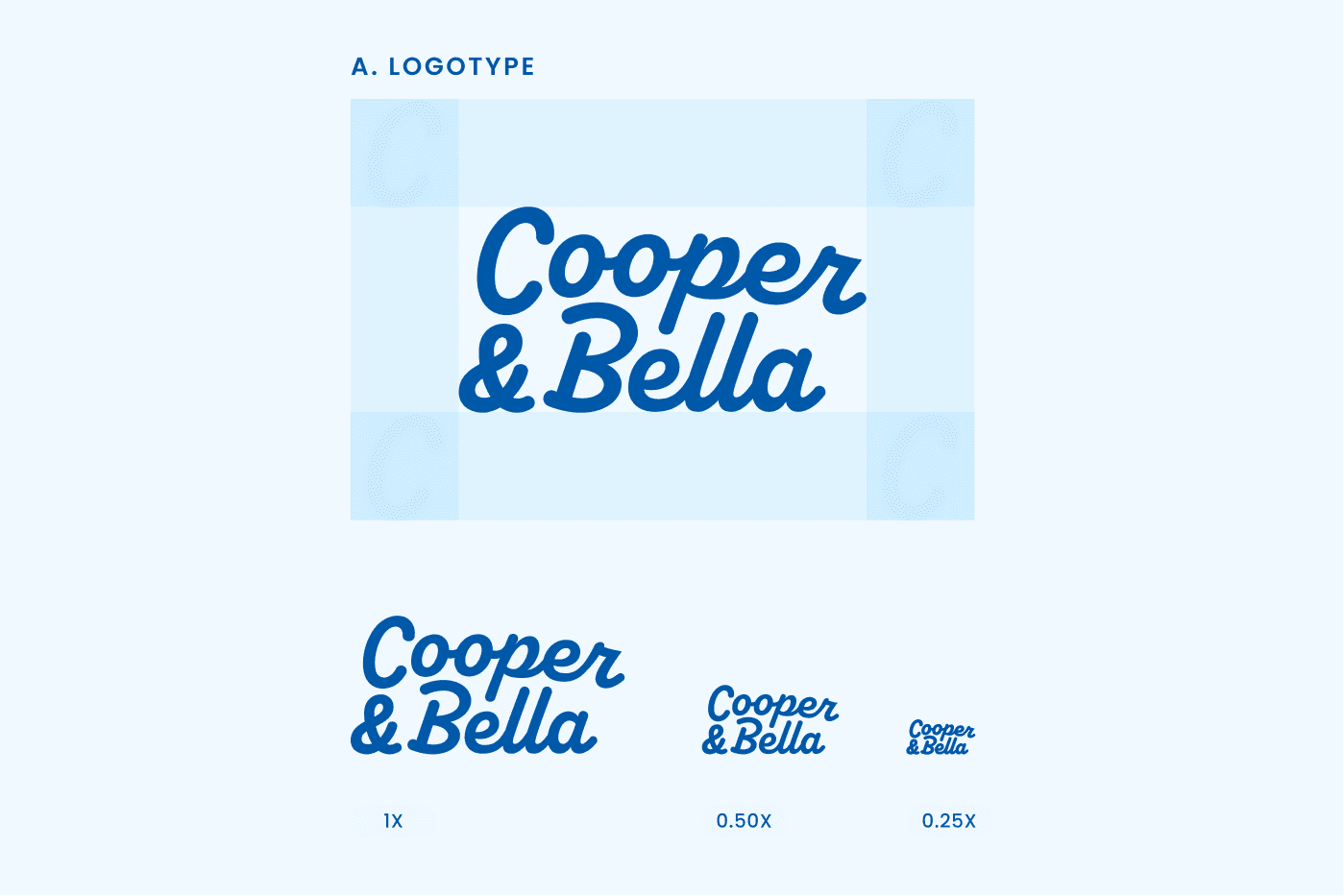
I swapped the cold supplement cues for a confident hand-drawn script logotype, a cheerful but credible blue palette, and a softer, more human voice. The direction was deliberate: earn trust through credibility, win hearts through warmth.
I documented the logotype with clear space rules and a scale ladder down to 0.25x, so the mark holds up at jar-lid size and in an Amazon thumbnail as easily as it does on a hero banner, a system the team can run without me in the room.
Packaging
Dense supplement science, reframed as benefits you can read in a second.
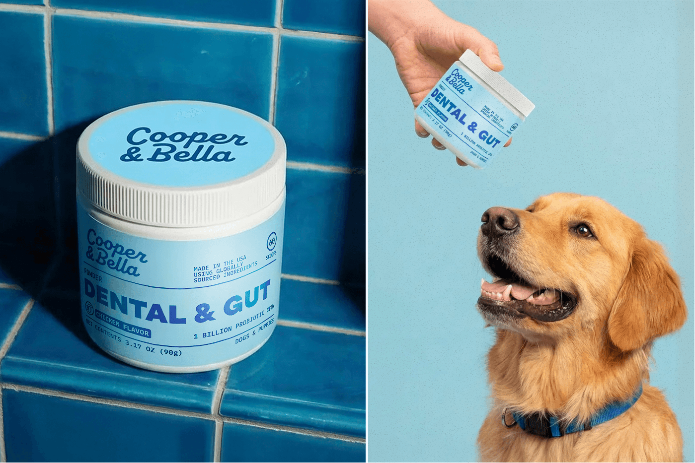
Probiotic CFUs, brown algae, sodium hexametaphosphate, green tea extract. On the original packaging, that ingredient deck read as intimidating jargon. I rebuilt the hierarchy so the label leads with the plain-language promise (Dental & Gut, chicken flavor, 60 scoops, 1 billion probiotic CFUs) and lets the technical proof support it rather than shout over it.
Clear, benefit-led layouts make the product feel easy to understand and easy to love at a glance, which is exactly what a shopper gives you on a crowded shelf or a phone screen.
AI Art Direction
A premium, fully art-directed catalog before they could afford a shoot.
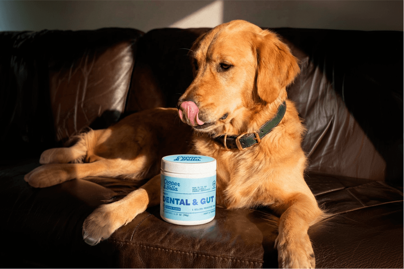
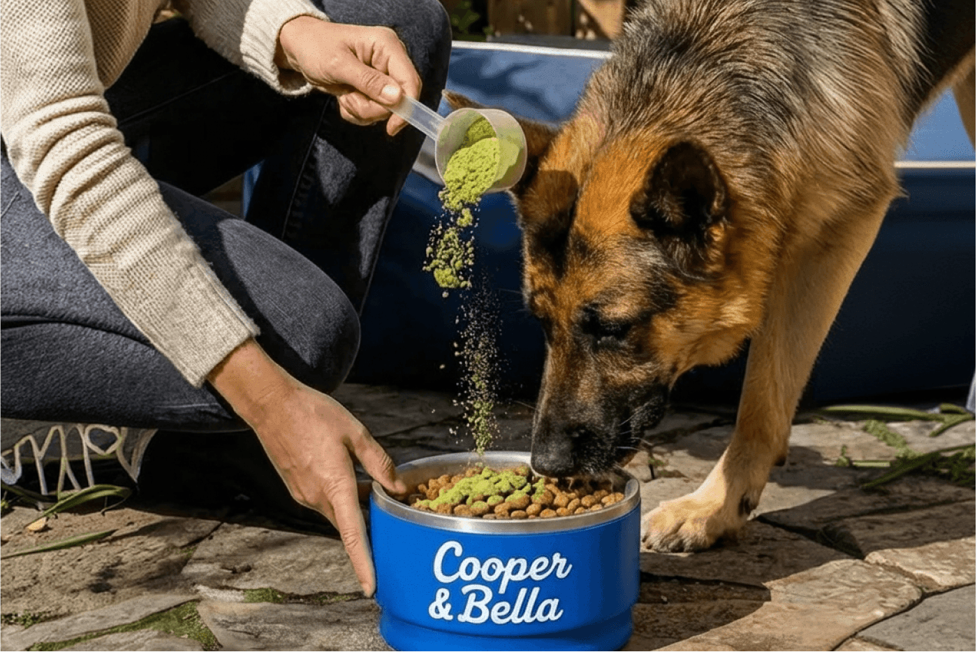
Budget was the constraint, not the ambition. I created high-end AI photography to give an early-stage brand a polished, cohesive look long before a full production shoot was realistic: real dogs, real homes, warm directional light, consistent styling.
The advantage was never just speed. Blending AI-generated imagery with hands-on retouching and tight art direction kept every frame on-brand instead of merely generated, which is the difference between a catalog that scales and one that has to be reshot.
Photography Library
One consistent visual world across every SKU and channel.
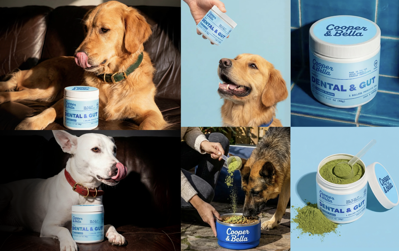
I built the library as a system rather than a set of one-off images: studio product on brand blue, tiled-bathroom dental cues, warm at-home lifestyle, and in-use feeding moments. Together they cover packaging, PDP, ads, and social without ever drifting off-brand.
Every Module Leads With a Benefit, Then Proves It.
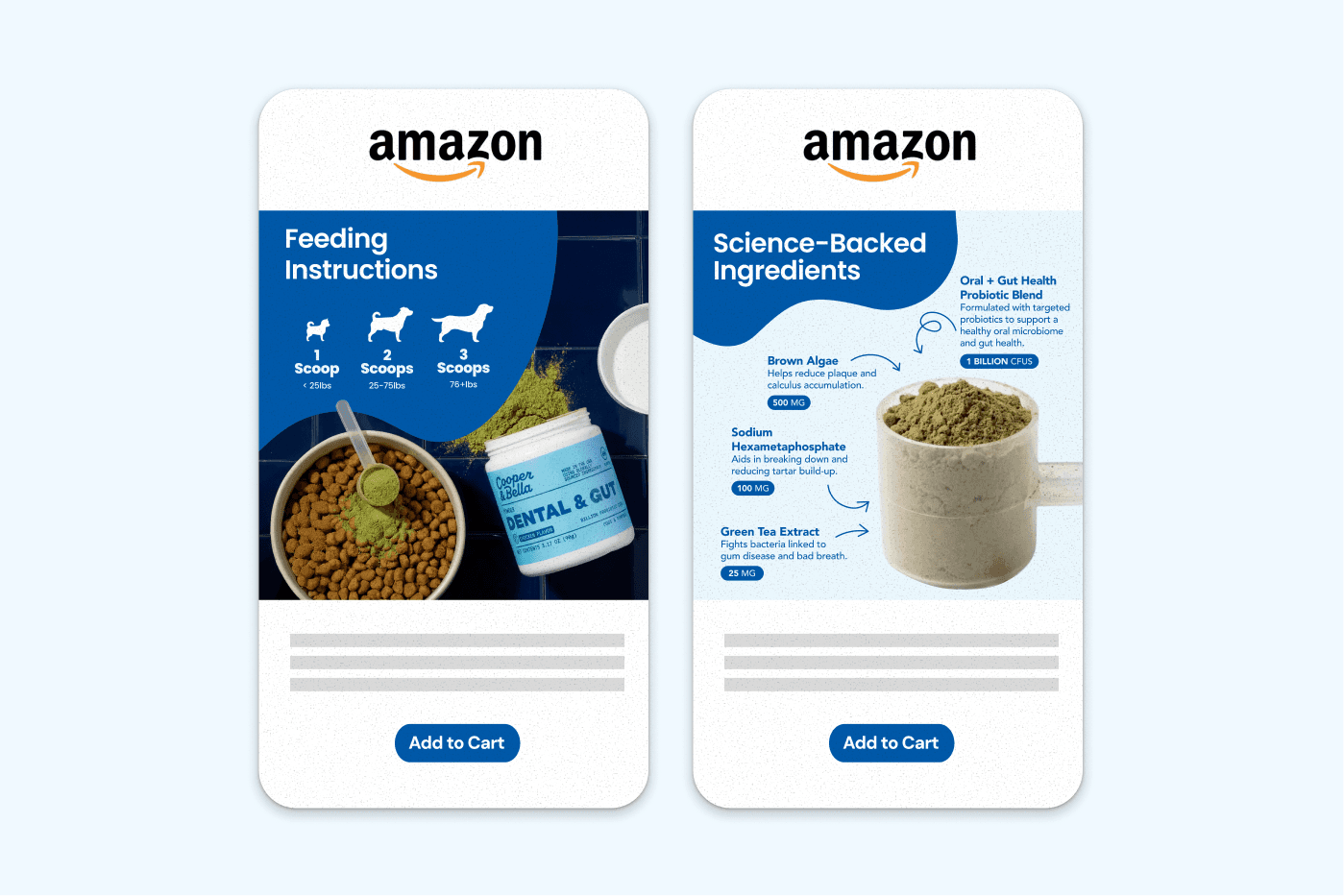
I developed the complete Amazon PDP for the hero product: image stack, comparison charts, ingredient breakdowns, feeding instructions, and A+ Content. The governing rule was simple: lead every module with a clear benefit, then back it with the science, never the reverse.
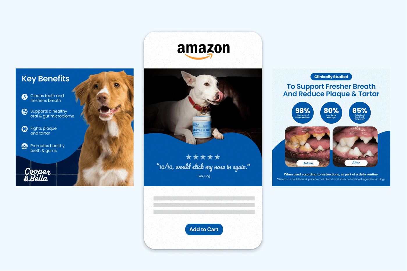
That sequencing is what keeps a supplement listing from becoming a wall of crowded infographics. Key Benefits opens with cleaner teeth and fresher breath. How We Compare answers the objection before the shopper types it. Clinically Studied brings the before-and-after and the hard numbers. Science-Backed Ingredients explains what each input actually does. The proof is all there, just never ahead of the reason to care.
Warm, playful photography carries every module, so the science stays human and the listing stays built to convert.
Image Stack
Benefits, social proof, and clinical evidence in scroll order.
I sequenced the stack the way a shopper actually decides: the benefit panel establishes what it does, a five-star review moment supplies the social proof, and the clinically studied module closes with 98% plaque biofilm disruption, 80% less tartar build-up, and 85% bad-breath reduction alongside a before-and-after.
Education Modules
More per scoop, and a chart that says why it matters.
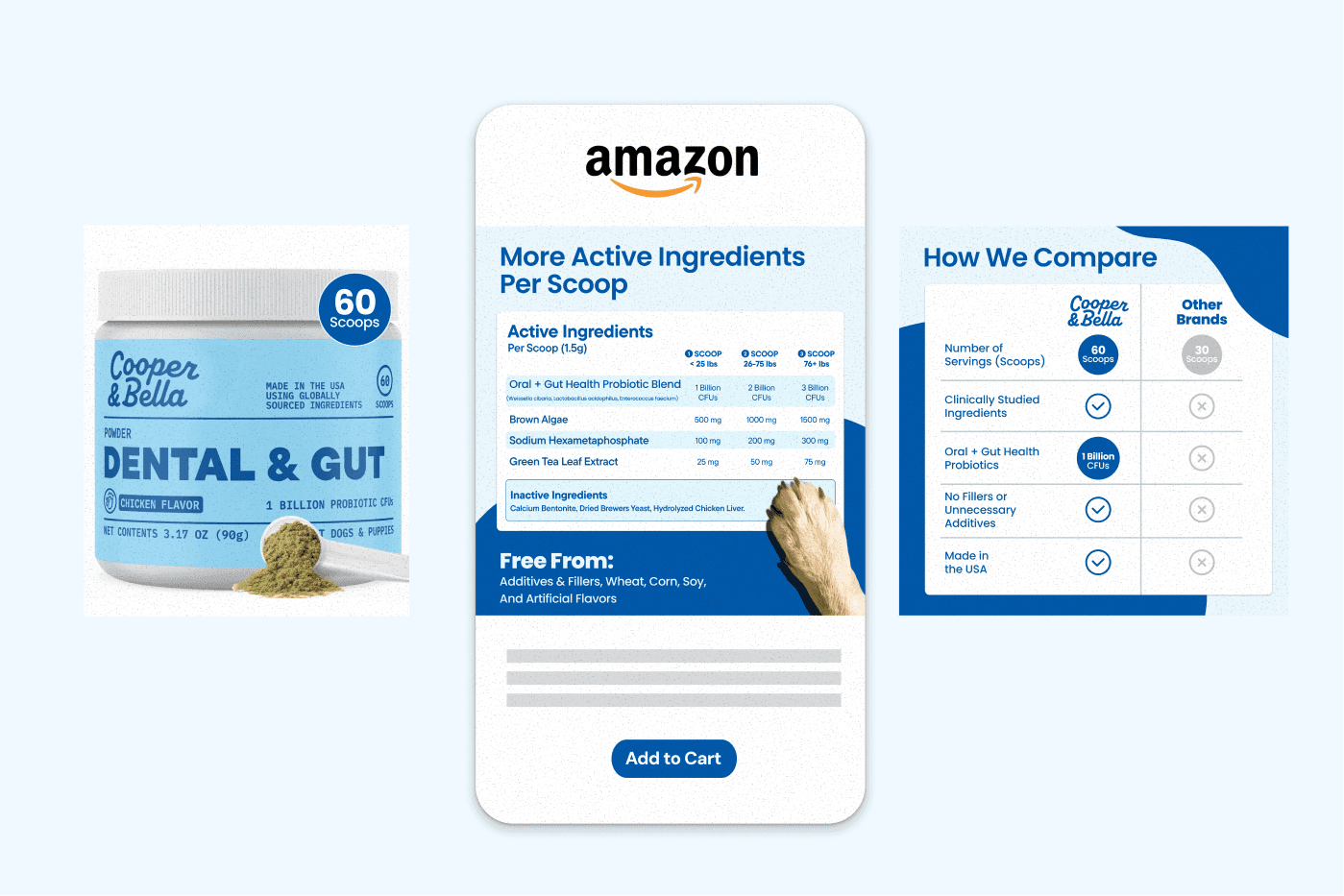
The Active Ingredients table makes dosing legible across weight ranges, and How We Compare answers the shopper’s real question (60 servings versus 30, clinically studied inputs, oral and gut probiotics, no fillers, made in the USA) without ever slipping into a spec dump.
A+ Content
The long scroll, built to hold attention all the way down.
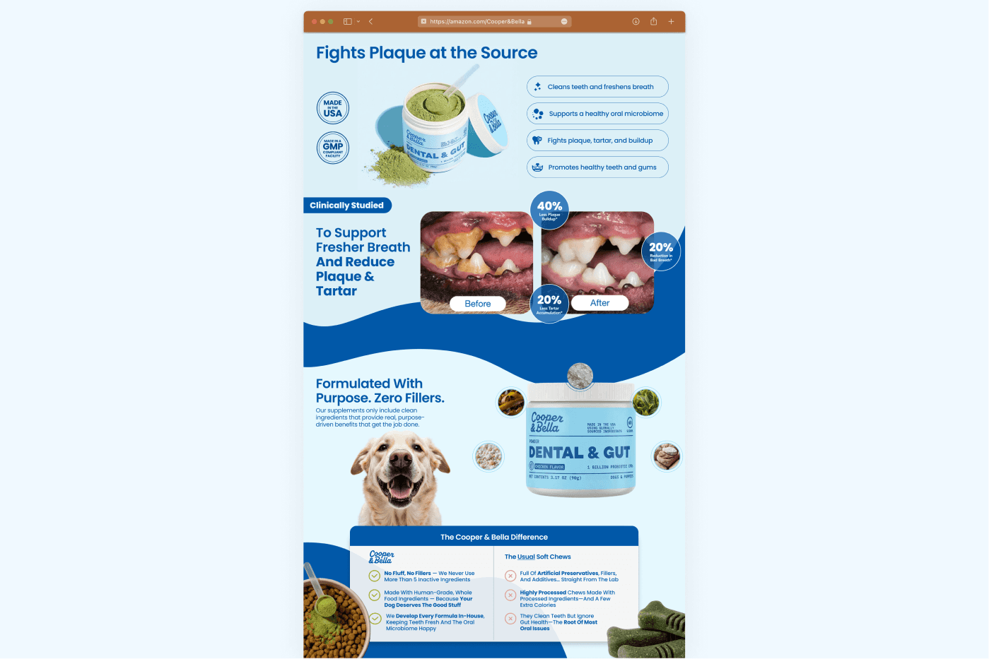
The A+ page carries the story past the fold: Fights Plaque at the Source, the clinical before-and-after, Formulated With Purpose and Zero Fillers, and The Cooper & Bella Difference set head-to-head against the usual soft chews.
Trust badges, benefit pills, and the brand’s signature wave shapes keep a dense, information-heavy page feeling friendly instead of clinical: the brief, resolved.
Built So the Next SKU Doesn’t Start From Zero.
I built scalable templates across packaging and Amazon so Cooper & Bella can launch future SKUs while staying visually consistent, keeping the playful tone intact as the catalog grows.
That is the leadership outcome I was after: not a set of files, but a system with clear enough rules that the team can extend the brand into new flavors, formats, and channels without needing a creative director to re-approve every decision.
Cooper & Bella Creative Library
Clinical credibility, warm delivery: from packaging to PDP to A+.