Epic Goods
A private-label snack and beverage brand built to pop off the shelf at ampm convenience stores: a flexible packaging system that scaled to 100+ SKUs, powered by art-directed AI photography built for retail speed and volume.
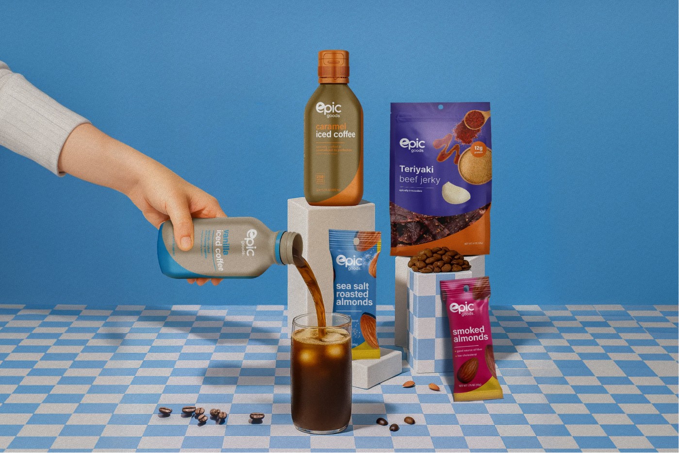
A Private-Label Brand Built to Pop Off the Shelf
I created Epic Goods, a private-label snack and beverage brand built to pop off the shelf at ampm convenience stores. I owned the program from the ground up: naming territory, logo, and brand identity through a flexible packaging system that scaled to more than 100 SKUs across candy, popcorn, nuts, jerky, iced coffee, smoothies, and electrolyte water.
From there I used AI-powered photography to produce premium product and lifestyle imagery at the speed and volume retail demanded, so the brand could launch new flavors quickly without losing a cohesive, premium look.
Brand Foundation
A friendly wordmark that reads across a busy gas station.
I started with the brand foundation: a friendly, lowercase “epic goods” wordmark with a playful looping “e” that reads instantly from across a busy gas station.
I paired it with a bold, saturated color system (electric blues, hot pinks, greens, and purples) so the logo could flip between knockout-white and full-color treatments and still feel like one brand whether it landed on a candy bag, a coffee bottle, or a beanie.
Packaging Architecture
One repeatable system that stretches across wildly different formats.
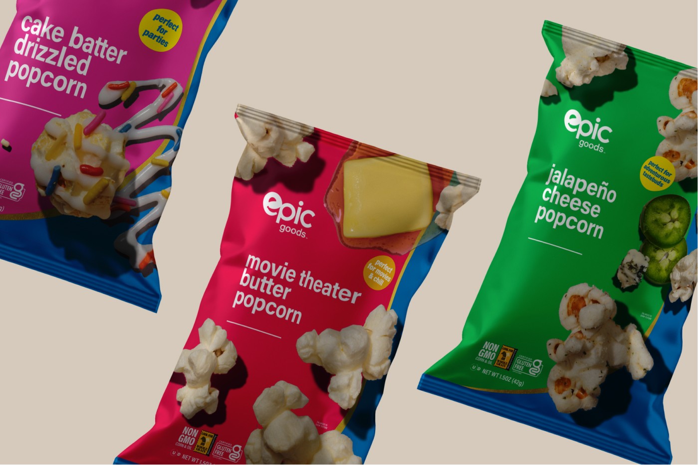
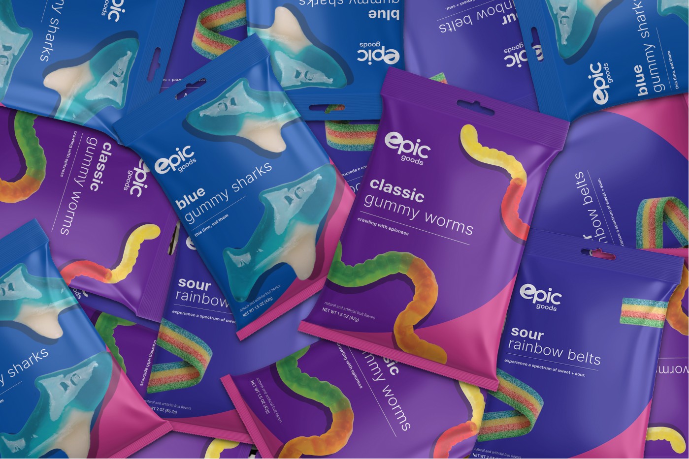
From that core, I designed the packaging architecture: a repeatable layout system of logo placement, a clean sans-serif type hierarchy, sweeping color blocks, benefit callouts, and appetite-driving product photography.
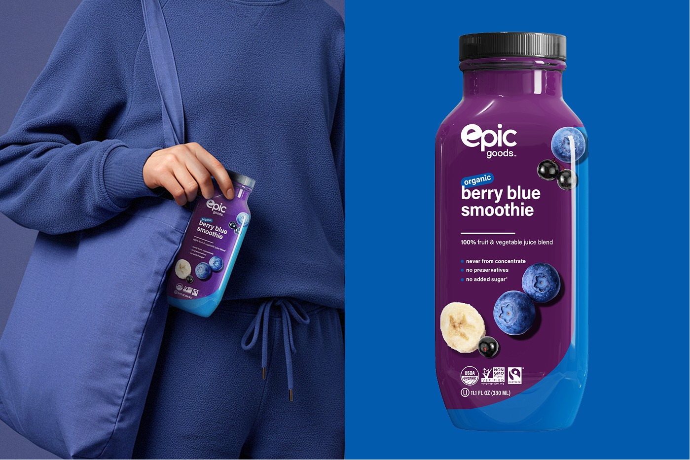
The framework was built to stretch across stand-up gummy pouches, popcorn bags, snack-nut packs, jerky, smoothie and iced-coffee bottles, and electrolyte water, while keeping every SKU unmistakably Epic.
Art-Directed AI Photography
A 100-SKU catalog of imagery, without 100 separate shoots.
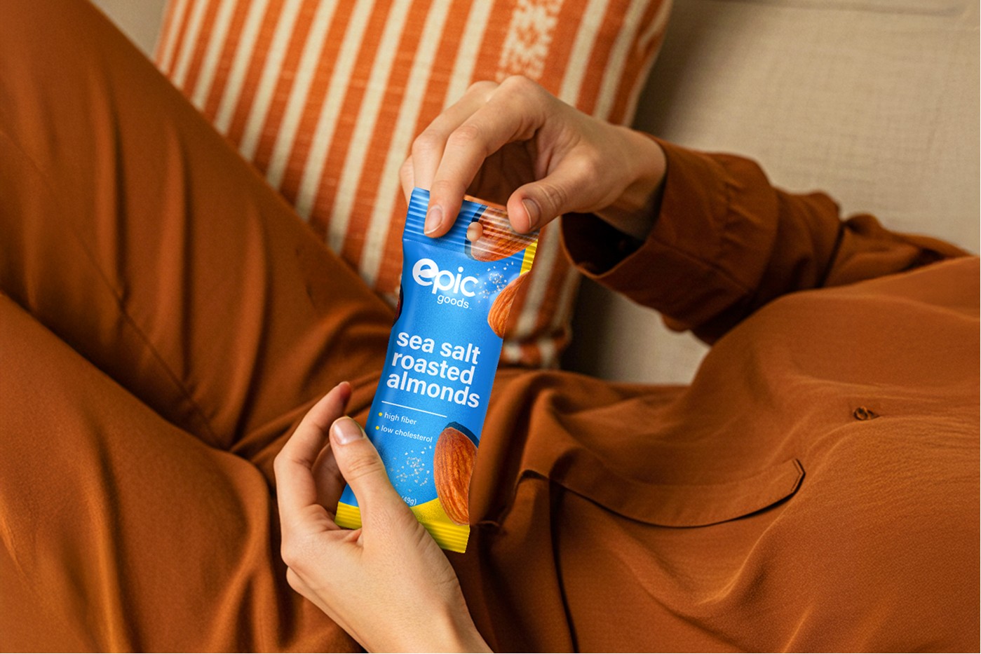
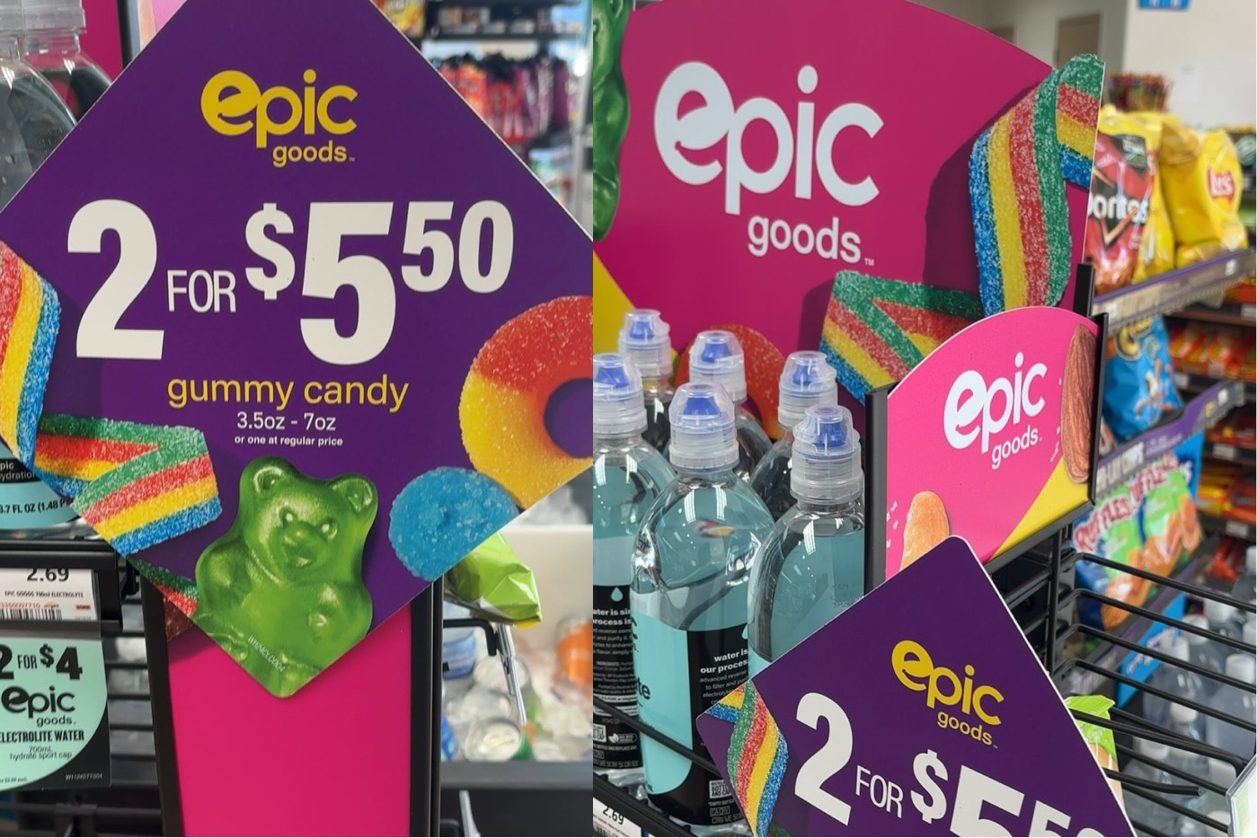
I art-directed and produced the imagery with AI-powered photography (generating photoreal hero shots, styled still lifes, and lifestyle scenes of people snacking at the beach, on the couch, and sharing gummies) that would have been cost-prohibitive to shoot individually across a 100-SKU line.
This let the brand launch new flavors quickly while keeping a cohesive, premium visual identity across every category.
A System That Carried the Same Energy Everywhere
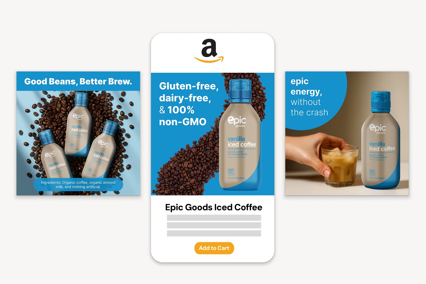
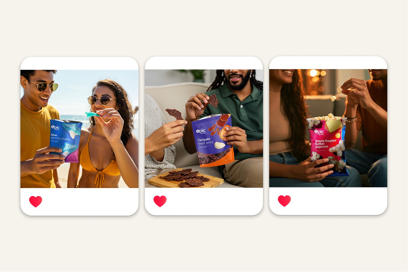
Beyond packaging, I extended the system into the full retail and digital ecosystem: ampm shelf signage and “2 for $5.50” price callouts, branded snack boxes and merch, and Amazon-style PDP and A+ content modules (“Good Beans, Better Brew,” “epic energy, without the crash”) so the brand carried the same energy from the cooler door to the product page.
The result is a scalable brand engine: a documented logo, color, type, and layout system designed so new flavors and categories can roll out fast and consistently. What began as a single concept grew into a 100+ SKU private-label brand with a unified shelf presence across ampm locations nationwide.
Launch Image Library
One saturated, appetite-driven system: built to launch flavors fast and stay unmistakably Epic.