MaryRuth’s
A high-volume vitamin and supplement brand shipping new creative every week. I art directed the weekly shoot program, covering new product launches, promotions, and whatever was trending that week. Every image went out as a performance ad test, and the results came back and set the direction for the next shoot: which background colors converted, which lighting held attention, which styling actually sold the product.
Every Frame Was a Test, and the Results Set the Next Shoot.
Vitamins are a hard category to photograph. The products are small, the labels are dense with claims and certifications, and the shelf is crowded with brands defaulting to the same clinical white backdrop. MaryRuth’s was moving too fast to guess at what worked, so we stopped guessing.
I art directed a weekly shoot cadence covering three things at once: new products coming to market, the promotions on deck, and whatever was trending and needed creative fast. Everything we shot went into performance ads as a test, which meant every week produced real data on which frames earned attention and which ones did not.
That data is what I planned the next shoot against. If a saturated backdrop outperformed a soft one, the next set got built in that direction. If a particular lighting setup or crop drove better results, it became the standard. The creative kept its personality, but the decisions behind it were accountable to how the images actually performed.
Shoot Cadence
New launches, promos, and trending products, every week.
Each week’s shoot list came from three places: products about to launch, promotions the marketing calendar needed assets for, and trending SKUs that suddenly needed creative to ride the demand.
Working on that cadence means the plan has to be tight. I scoped each shoot day so it covered all three needs at once and produced hero frames, cropped social cuts, and PDP-ready assets in a single session, rather than sending the team back to set every time a new placement came up.
Styling & Set Design
Styling choices we could actually measure.
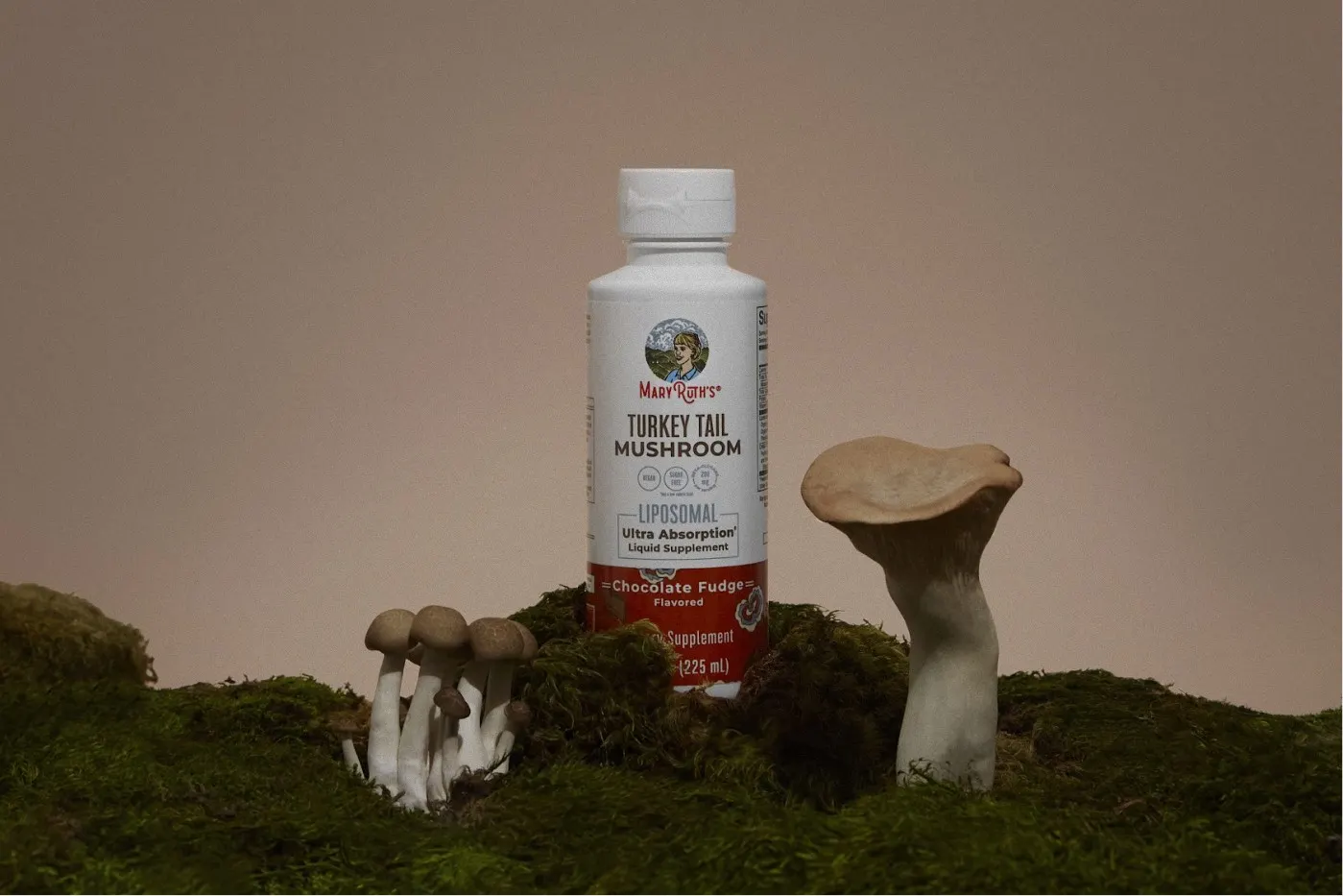
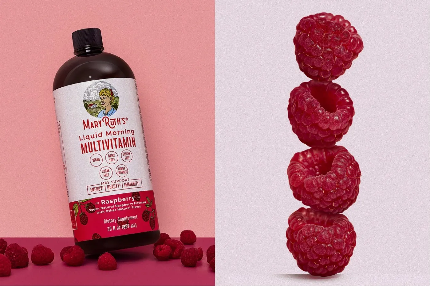
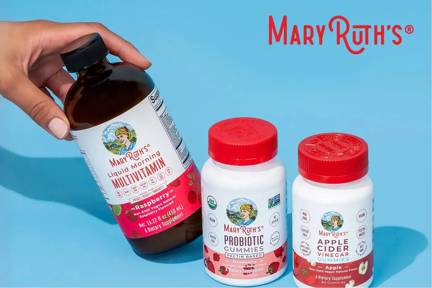
Pairing each product with its hero ingredient is the fastest way to communicate flavor and benefit without a line of copy: peaches with the peach mango multivitamin, raspberries with the raspberry liquid, mint with the chlorophyll drops.
Testing told us how far to push it. Frames with real produce and a clear lifestyle context consistently held attention longer than an isolated bottle, so grass, totes, and fresh fruit earned their place on the shot list. Props that tested flat got cut, which kept every set decision tied to a result instead of a preference.
Lighting & Post
Lighting specs written from what the ads told us.
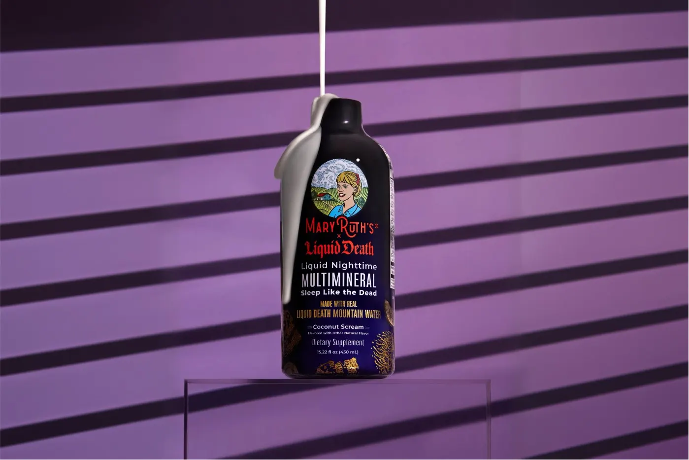
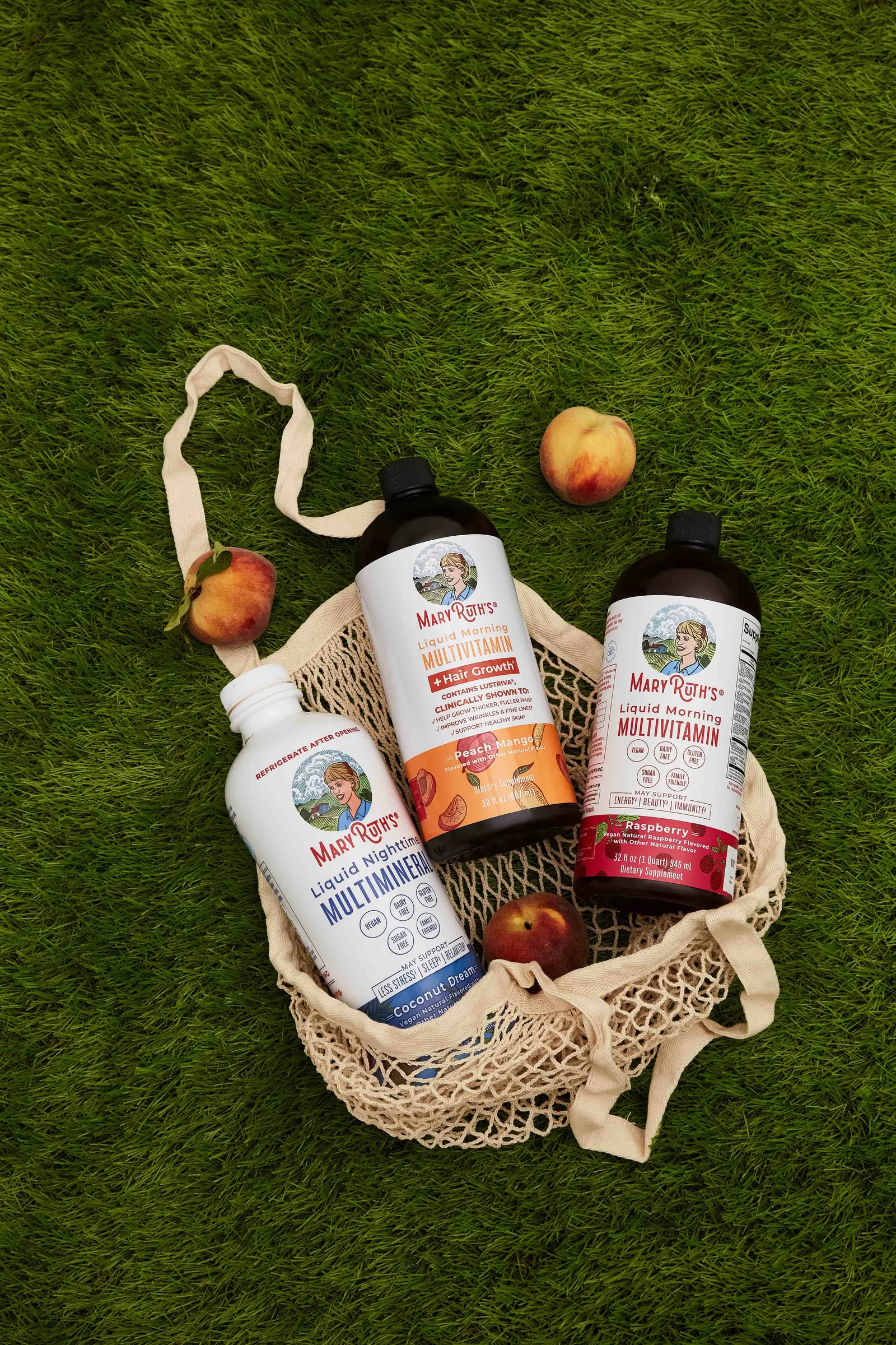
Lighting was one of the clearest variables to test. Bright, clean setups with controlled shadow density held attention better than moodier alternatives in this category, so that became the spec rather than a stylistic preference.
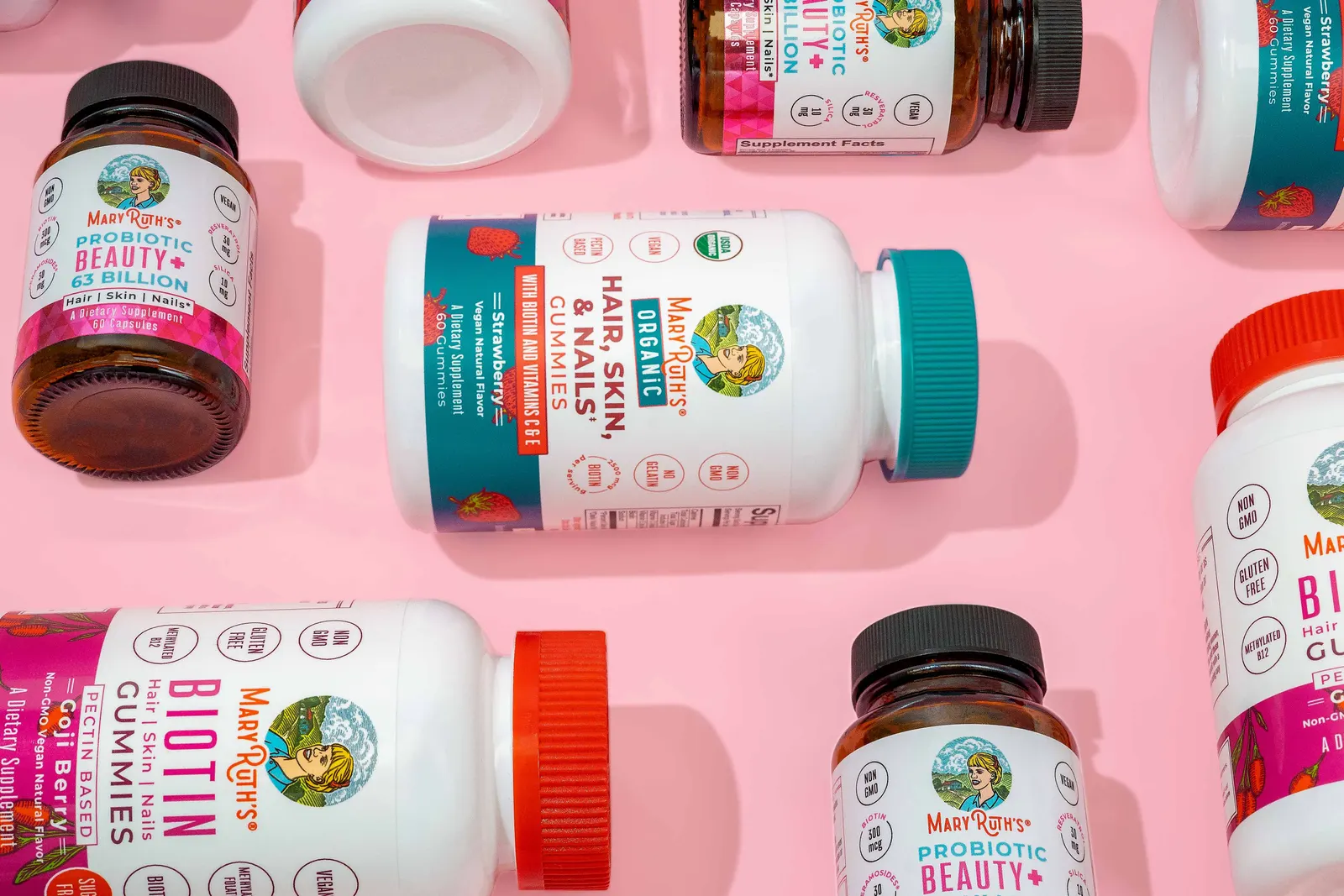
Once a setup proved out, I wrote it down: shadow density, label legibility at thumbnail size, and how a liquid should read through glass. That gave the retouching team a standard to hold, so amber bottles, white gummy jars, and dropper sets could sit side by side in a carousel without one frame looking borrowed from another brand.
Background Color Testing
The backgrounds that won the ads set the palette.
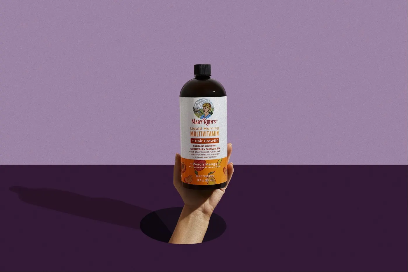
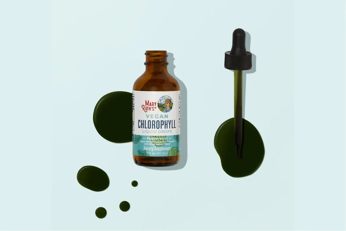
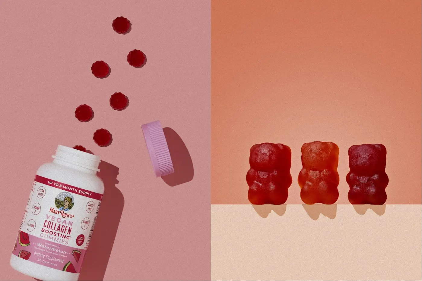
Background color was the single most useful thing we tested. Running the same product against different backdrops in performance ads showed plainly which colors stopped the scroll, and the winners came back to set as the starting point for the next round of shoots.
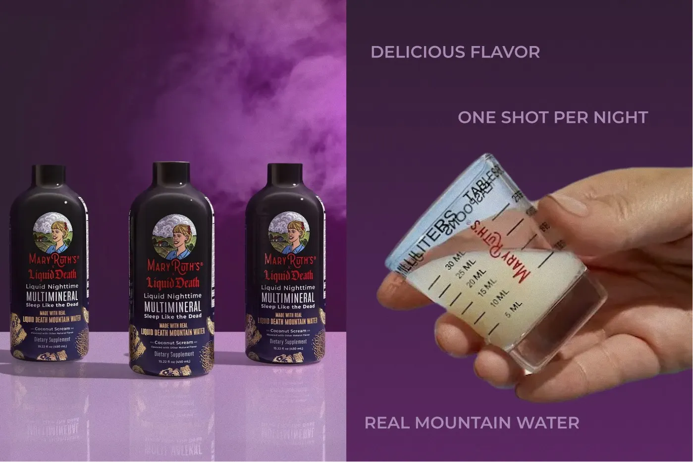
That is how the range landed on saturated, flavor-led environments instead of the clinical white the category defaults to. Each SKU got a color drawn from its own flavor, validated against the ad results, then tuned to sit inside the wider MaryRuth’s palette so a growing catalog never fragmented.
What Won in Ads Went Straight to the Product Page.
Because the ad tests ran first, the PDP was never a guess. The frames that proved they could earn a click were the same ones that carried the listing, so the strongest creative was already identified before it went anywhere near the storefront.
On a product page the job is unambiguous: the shopper needs to identify the format, the flavor, and the size in about a second. So the product leads every frame, the label stays fully legible, and the styling supports that read instead of competing with it. The color and the fresh ingredients are what keep the discipline from turning into another sterile pack shot.
The same frames flex out to promotions and social without a reshoot, which is what makes a library worth the investment rather than a cost per campaign.
PDP Design
Product first, with just enough set to make you want it.
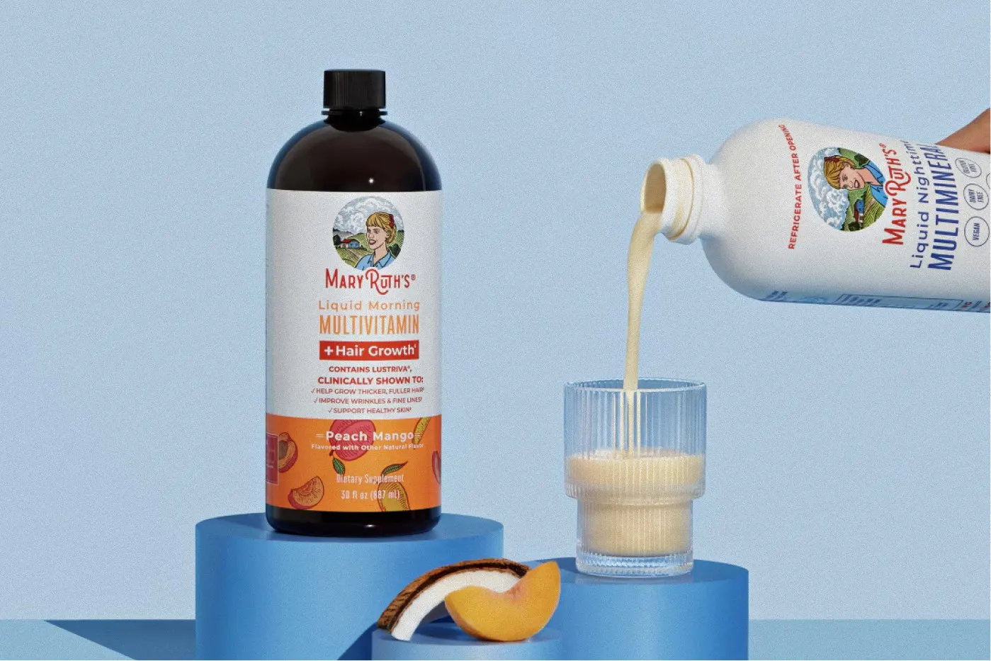
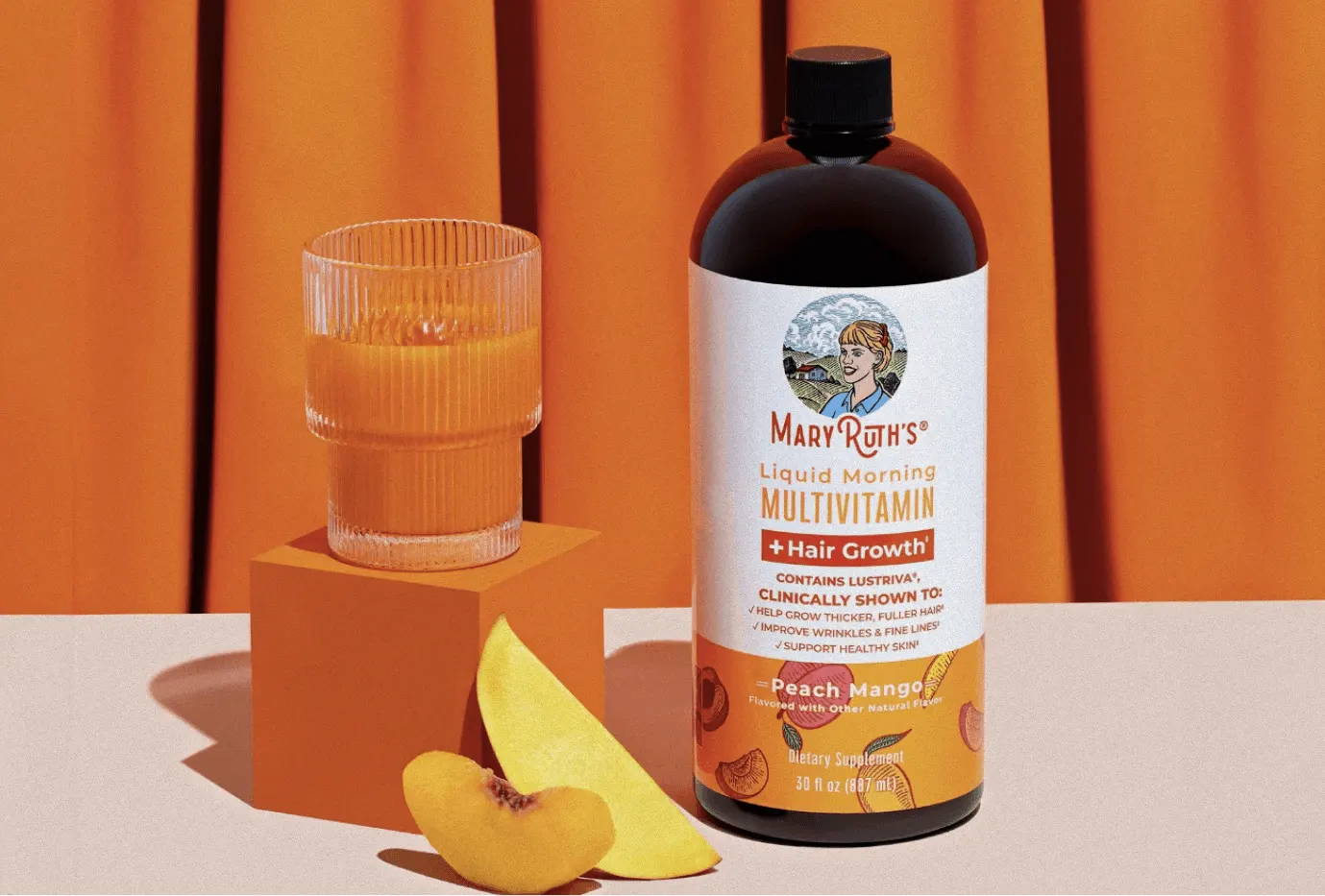
The hero frame carries the most weight on any listing, so I built these to put the label front and center while the set does the emotional work: a warm curtain, a poured glass, sliced fruit at the base.
It reads as appetite rather than pharmacy, and the clinical claim block on the label stays completely readable at thumbnail size.
Ingredient Pairings
The vitamin C story, told with fruit instead of a chart.
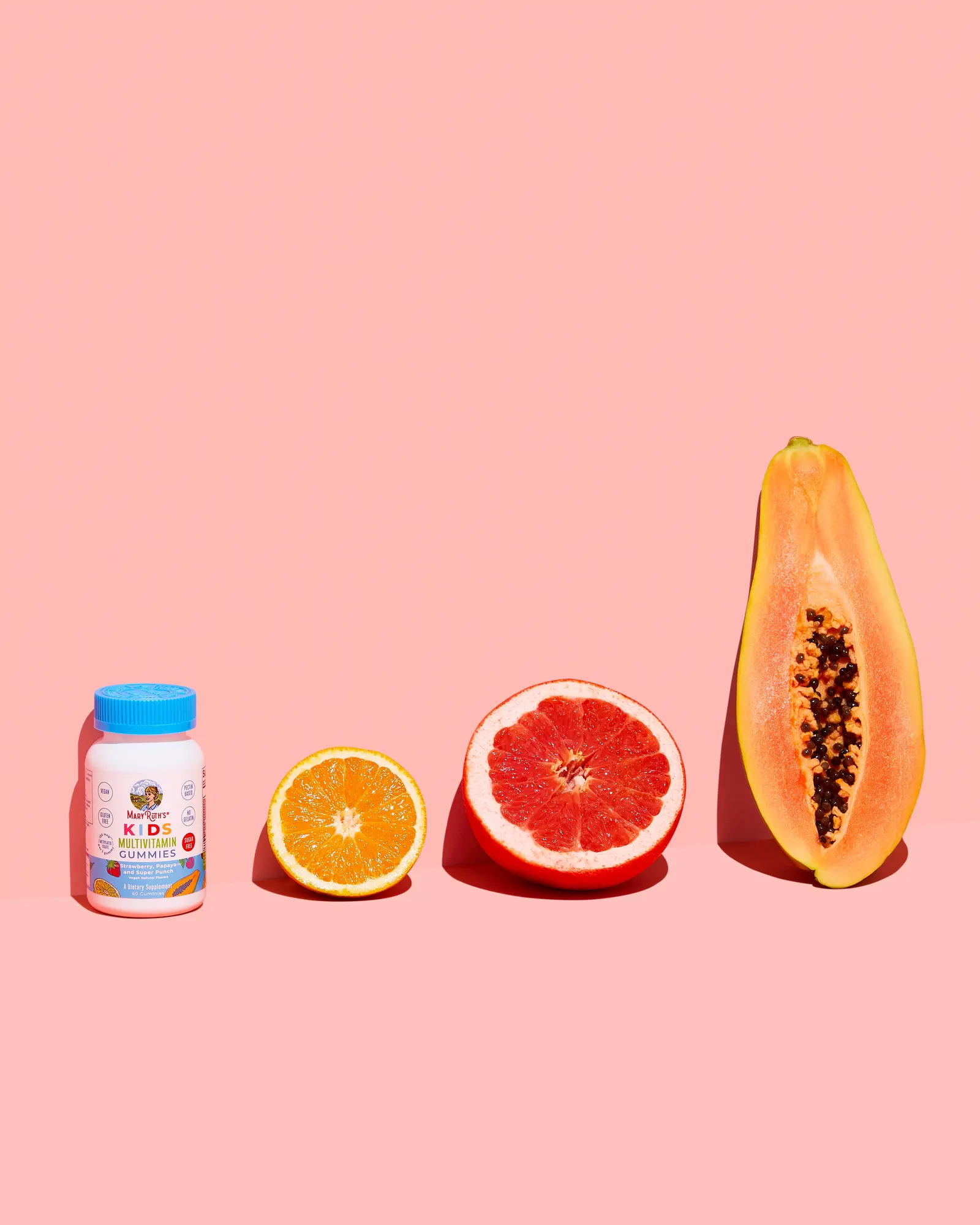
For the kids range I used a simple scale progression, lining the bottle up with orange, grapefruit, and papaya so the ingredient story lands visually before anyone reads a supplement panel.
Generous negative space keeps a busy, multi-flavor kids product feeling calm and premium, and gives the merchandising team clean room for headlines and promotional overlays.
A Loop, Not a Folder of Files.
The real deliverable was never any single shoot. It was a working loop: shoot the week’s launches, promos, and trending products, push the frames into performance ads, read what the results said about color, lighting, and styling, then build the next shoot on the answer.
That is what let a fast-moving catalog keep launching without the imagery drifting off brand or off performance. The creative decisions stayed bold, but they stopped being opinions, and the team was left with documented rules they could extend into new flavors and formats on their own.
MaryRuth’s Creative Library
A library built one tested week at a time.