Neato
Neato is a 2P eCommerce acceleration partner that runs Amazon like a real retail business for middle-market and enterprise CPG brands. I led a full rebrand around the new smiley “n” wordmark (a Lausanne-based type system, a punchy color palette, a custom icon library, and the marketing website) to land one clear promise: “Amazon. Handled.”

A Rebrand That Feels Fresh, Confident, and Alive
Neato runs Amazon like a real retail business for middle-market and enterprise CPG brands, owning inventory, pricing, and execution so their partners stop managing vendors and start collecting purchase orders. The old brand did not match that confidence. Starting from the new smiley “n” wordmark, I led a full rebrand, building out a Lausanne-based type system, a punchy color palette, a custom icon library, and the marketing website, to land one clear promise: “Amazon. Handled.” The result is a brand that feels fresh, confident, and unmistakably alive.
neato.comBrand Foundation
A smiley “n” mark that’s friendly, ownable, and enterprise-sharp.
The “neato” wordmark and smiley “n” mark were my starting point, a friendly, ownable symbol that signals the brand’s playful, quick-thinking personality while staying sharp enough for an enterprise audience. I built the rest of the identity around it and defined how it works in both light and dark, so it anchors everything from the site header to social.
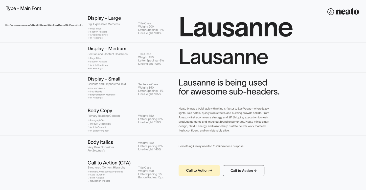
Type System
Lausanne, from big expressive display down to scannable body.
I designed the type system on Lausanne, with a clear hierarchy from big, expressive display moments down to readable body copy and structured calls to action, so every headline feels bold and every page stays easy to scan.
Color System
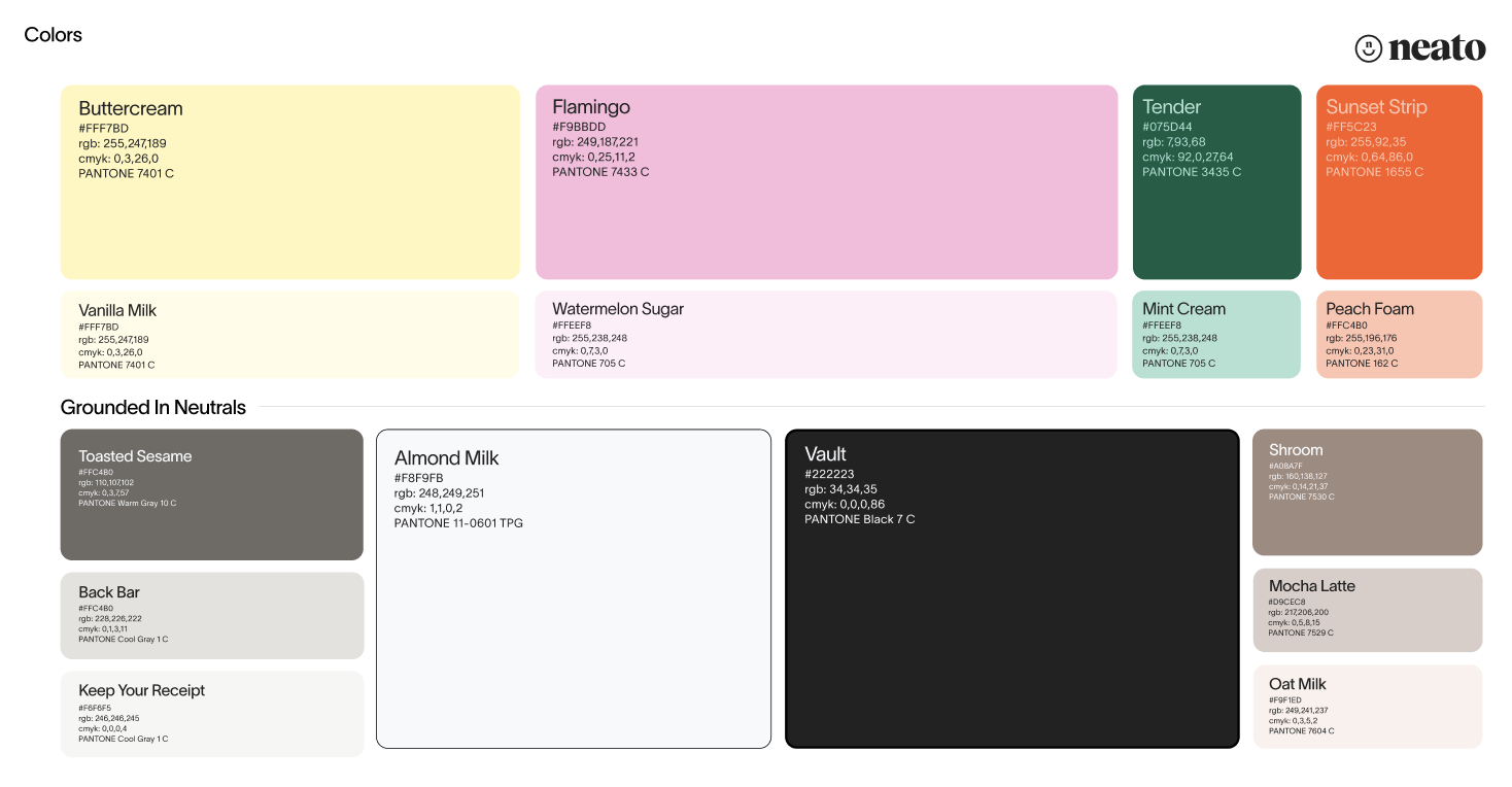
Candy-leaning brights, grounded by a deep “Vault” near-black.
The color system pairs warm, candy-leaning brights (Buttercream, Flamingo, Sunset Strip) with grounded neutrals and a deep “Vault” near-black, giving the brand range to feel energetic in campaigns and composed in product UI.
Iconography
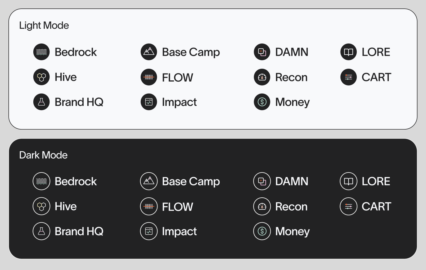
A custom icon library for services and internal tools.
I created a full custom icon library with light and dark variants (Bedrock, Hive, Brand HQ, FLOW, Recon, Money, and more) to give Neato’s services and internal tools a cohesive, branded visual language.
Art Directed Around “Amazon. Handled.”
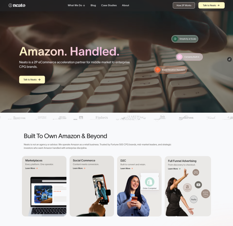
I designed and art directed the marketing website around the “Amazon. Handled.” promise: from the hero through the “How 2P Works” model, “The Sauce” service grid, and conversion-focused CTAs.
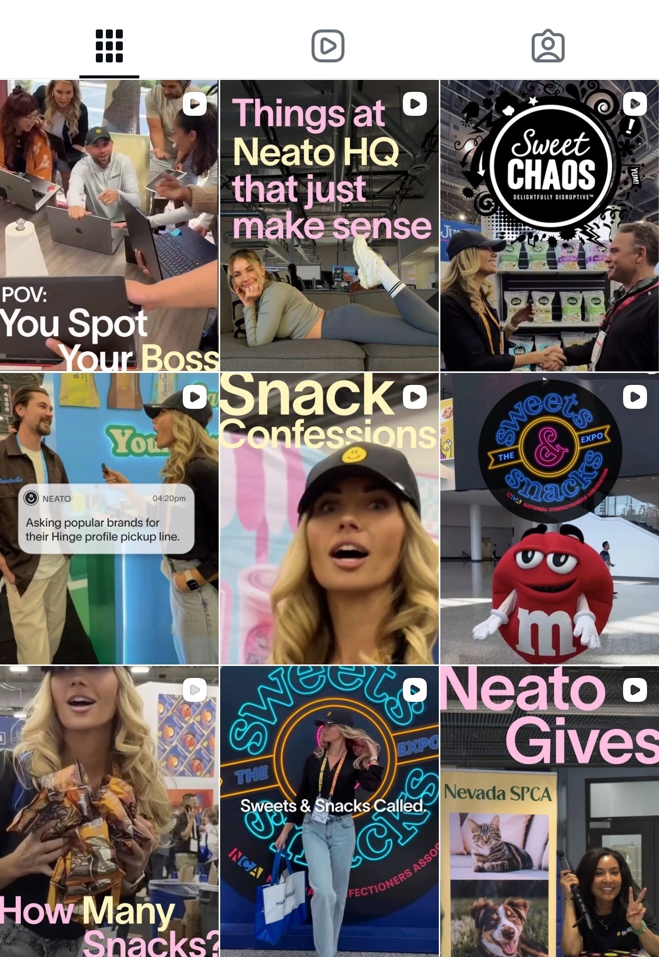
Then I carried the same bold, witty energy across social content and campaign creative, so every channel feels like one confident, quick-thinking brand.
Neato Brand Library
One confident, quick-thinking brand: from wordmark to website to social.